
What's Really in Your Average Day Demand?
Average Day Demand is one of the most commonly used metrics in a water utility.
In Australia, it's expressed in kiloliters per day per connection.
From that single number, a surprising number of decisions follow.
Planners scale it up by multiplying it by a peaking factor to get the design Peak Day Demand.
This is used to size treatment plants and distribution infrastructure, underpinning massive capital investment.
Modelers use it to include water loss in their hydraulic models.
For example, some use 15% of Average Day Demand for their unaccounted-for water metric.
Operators also depend on Average Day Demand.
When a planned pipeline shutdown is needed, hydraulic modeling will typically use Average Day Demand conditions as the basis for simulating impacts before proceeding.
One number, linked to capital infrastructure and operational decisions.
So, it's worth asking - what's actually inside that number?
And does it still hold for the system it's meant to represent?
These answers will come from drilling into the network data.
Where does Average Day Demand come from?
At utilities, Average Day Demand most commonly comes from the source data at the treatment plant or dam.
This is because the source data – with a flow meter or two – is easier to fit in a spreadsheet and less complex compared with tens or hundreds of network flow meter data sets.
But a limitation is that what’s captured at the source is an average of the entire system and therefore misses the spatial variability of demand that is evident from water network data mining.
So, in short, network subsystems will actually have higher or lower averages compared with the source, and some will be about right.
In the game of trying to reduce utility risk while not overspending on capital infrastructure, this variability matters.
How does SensorClean derive the average for subsystems?
Figure 1 shows cleaned daily subsystem consumption with maximum daily temperature for example Subsystem 21.
You will notice this subsystem has a trend, probably resulting from connection growth.
Now if we used all of the data in Figure 1 to calculate Average Day Demand for Subsystem 21, we would get a number like 181 kiloliters per day.
But that includes years when the subsystem had lower demand, so 181 understates the demand it serves today.
Using the last three years to calculate the average, we get 225 kiloliters per day.
SensorClean defaults to the last three years - far enough back to average across a range of summers, but recent enough to describe the subsystem as it is now.
Where historical connection data is available, for example from hydraulic model shapefiles, SensorClean incorporates this into the analysis to better understand what’s driving the trend i.e. connection growth or weather uplift.
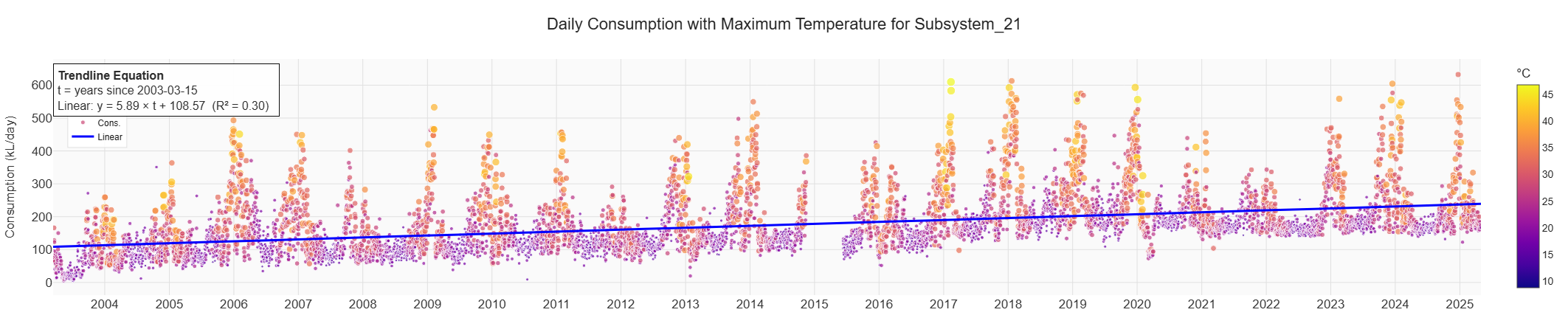
Figure 1 Example Subsystem 21 with cleaned daily consumption, daily maximum temperature and linear trend line
How does SensorClean remove weather uplift?
It's sometimes unclear whether a utility's Average Day Demand has the weather uplift removed - the extra demand driven by hot, dry conditions.
The size of that uplift varies between subsystems, and from summer to summer.
An average calculated over unusually wet, mild summers carries less uplift than a typical year, so it understates what a normal summer would bring.
To normalize demand in temperate climates, SensorClean uses regression analysis with a threshold of 20°C (68°F).
Below that, outdoor water use is insignificant and demand flattens out, leaving the indoor profile that doesn't respond to weather.
Days above 20°C go into the regression, with temperature, antecedent rainfall (how dry it's been) and day of the week as the key variables. Public holidays are treated as weekend days.
One distribution system, ten different subsystem averages
Figure 2 shows Average Day Demand, observed and weather normalized, for ten subsystems within a single water distribution system.
The first thing you'll notice is the spread.
Average Day Demand runs from around 0.34 to 1.00 kiloliters per day per connection.
That's close to a three to one difference in demand per connection, inside one distribution system. Note that connection growth over three years was assumed to be small enough to ignore.
The second is the gap between each pair of bars. That's the weather uplift, and it runs from barely detectable in some subsystems to around a third of demand in others.
Some of that spread traces to customer mix, for example apartments don't have thirsty lawns like houses do.
The rest comes from things a connection count can't see: lot size, dwelling density, local temperature and rainfall, and whether large non-residential customers are present.
A single system-wide average doesn't just miss this spread. It hides the fact that the spread exists at all.
Where a utility has non-residential smart meter data, that component can be removed to calculate residential demand more accurately.
The split between houses and apartments is then inferred by regression on the utility's connection data (see blog).
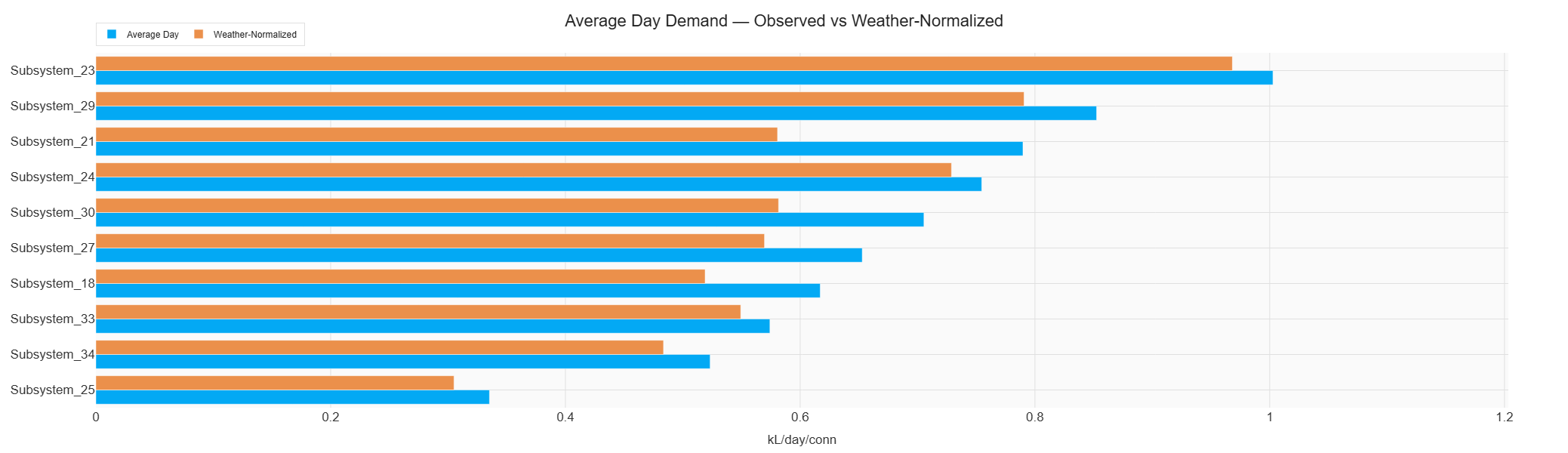
Figure 2 Average Day Demand (kL/Day/Connection) for observed vs weather normalized for ten subsystems within a water distribution system
The average doesn’t hold across the year
Operators simulate planned shutdowns against a demand profile.
If that profile is an annual average, a summer shutdown gets modeled on conditions that don't apply.
Figure 3 shows each month's average weekday and weekend demand profile in liters per second for Subsystem 21, across the last three Australian financial years – which does not split the summer months.
The monthly variability is substantial, driven by seasonal temperature and how dry it's been.
A December shutdown and a June shutdown are different problems.
SensorClean outputs shutdown profiles that capture this seasonal variability, along with uplift (if any) from the forecast temperature for the day of the shutdown.
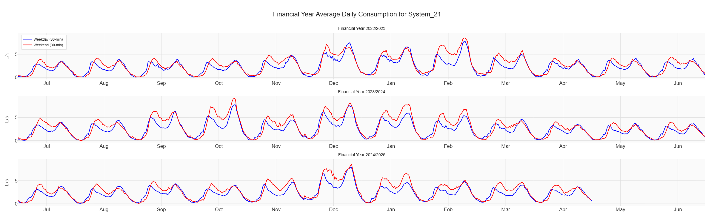
Figure 3 Subsystem cleaned average demand profiles (L/s) for weekdays and weekends, by month, across three financial years
In summary
Average Day Demand looks like a single number, but it underpins capital and operational decisions.
Your network's SCADA and weather data give you a better one by using recent years, capturing the spatial variability of demand, and taking the weather out.
Historical connection counts, where a utility holds them, are useful for separating real demand growth from connection growth.
And where an average won't do, for example modeling a summer shutdown, the same data gives you the seasonal profile instead.
That's evidence in place of assumption, before the decisions that depend on it are made.
If you want to know what's inside your own Average Day Demand, get in touch.